Brief
Rascals Espresso Bar set out to create more than just a local café — the goal was to build a brand that balances high-quality coffee with genuine personality. The challenge was to capture that “walk the line” energy: professional but relaxed, polished but playful, and deeply connected to its Lower Hutt community.
Inspiration
The visual direction draws from a mix of modern café culture, playful typography, and clean, confident layouts. Inspiration focused on brands that balance personality with restraint — ensuring the final identity felt expressive and memorable, without losing clarity or professionalism.
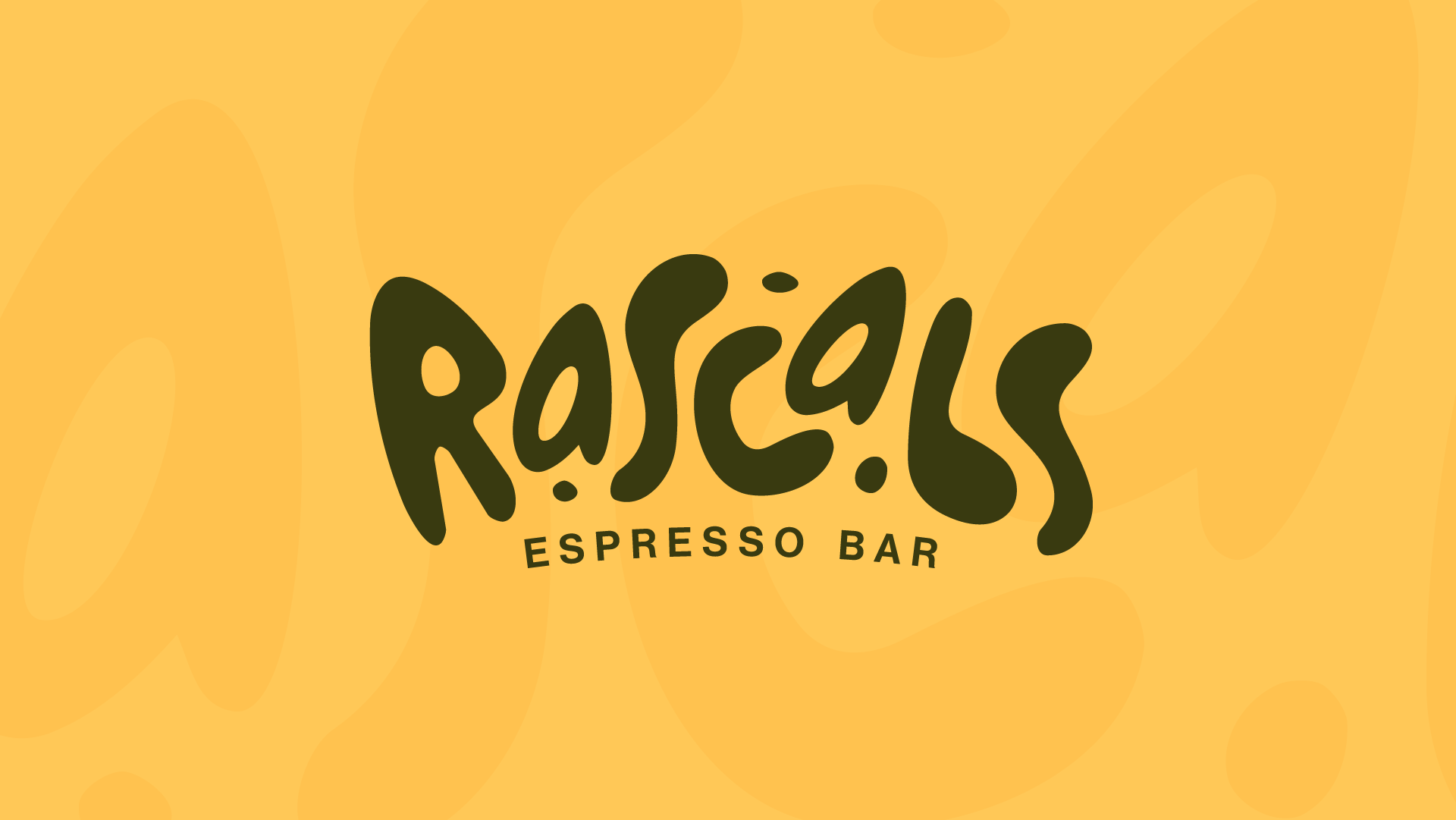
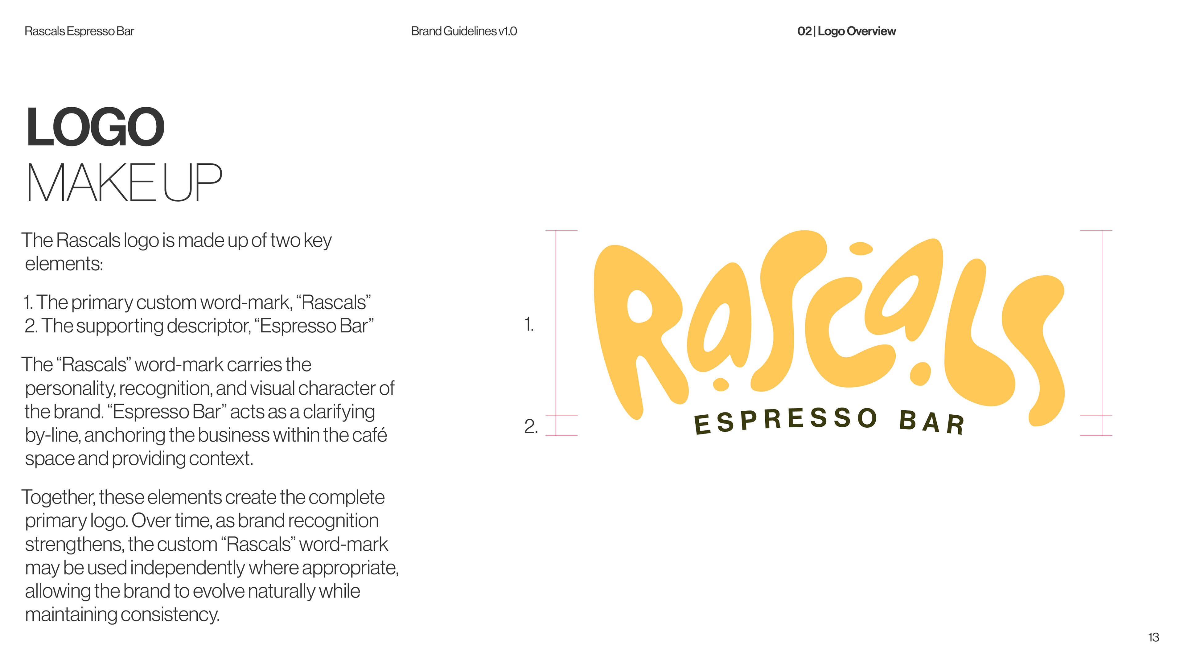
The Logo
The Rascals logo is built around a custom hand-drawn wordmark, designed to capture the brand’s personality and individuality. The expressive lettering gives the brand its distinctive voice, while the structured “Espresso Bar” descriptor grounds it with clarity and purpose. Together, they create a flexible identity that feels both fun and refined.
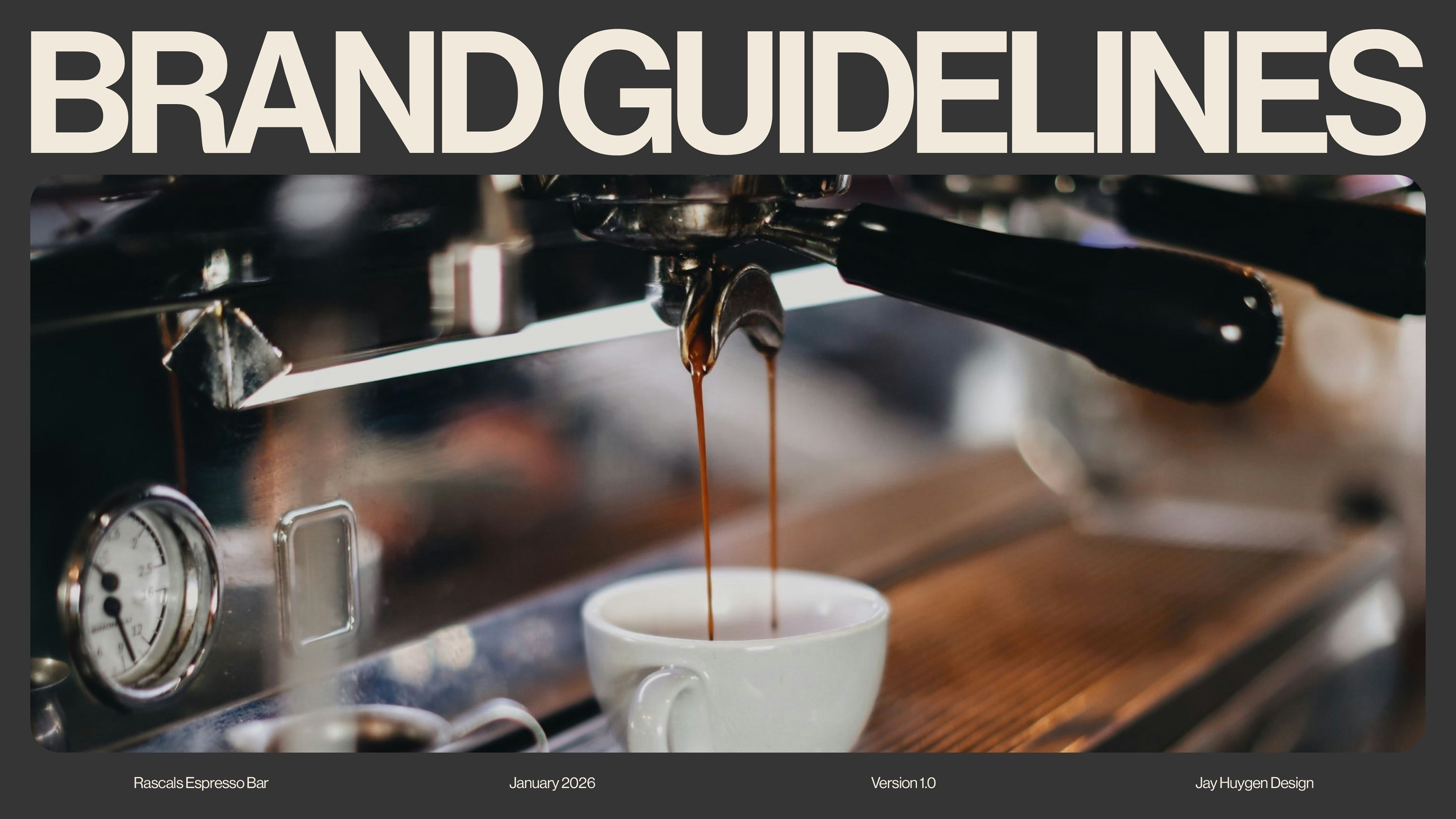
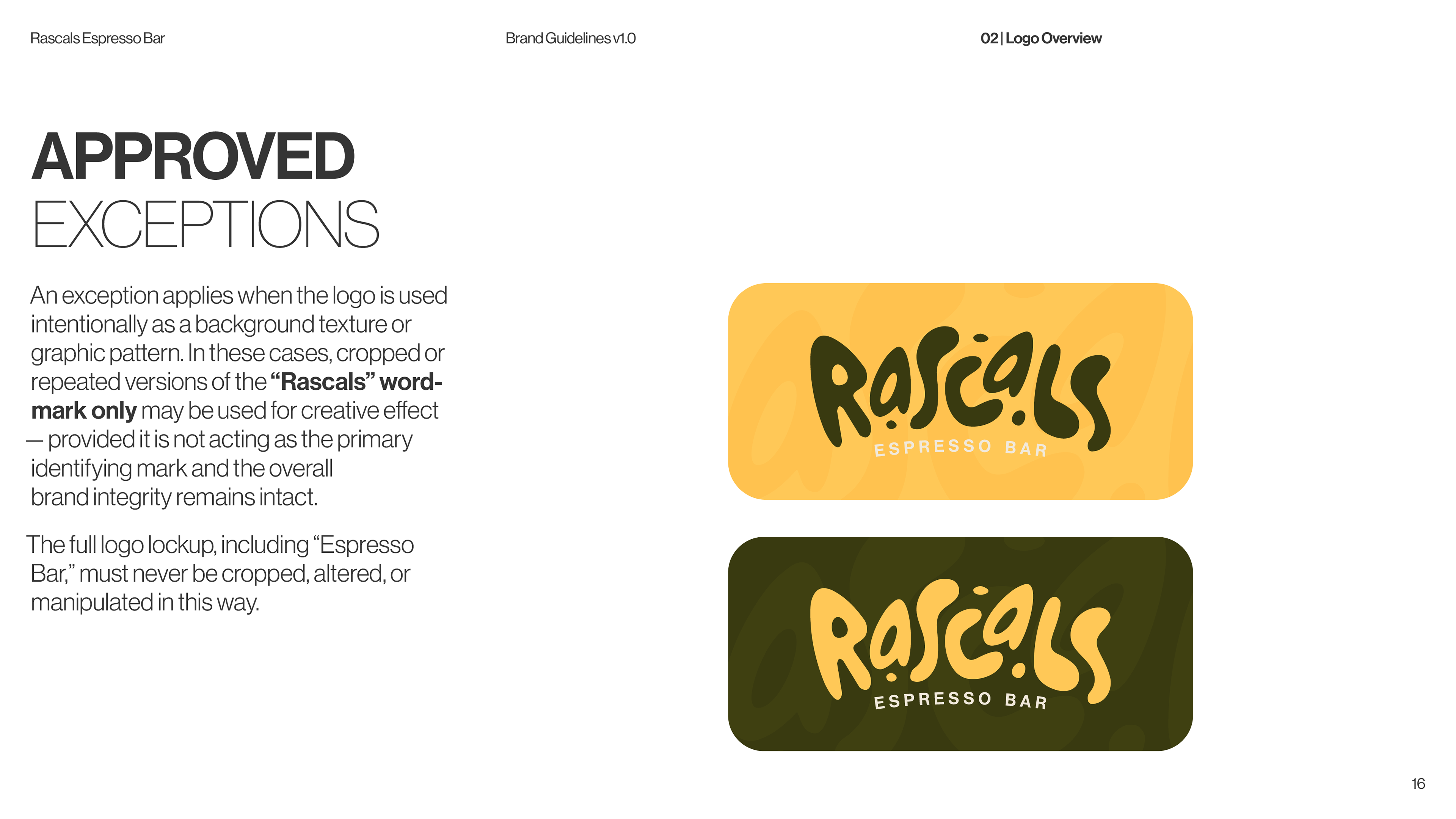
Brand Guidelines
The brand guidelines were developed to ensure consistency across all touchpoints as Rascals grows. They provide a clear framework for how the brand should be expressed — from logo usage and typography through to colour and sub-brands — while still allowing room for creativity and personality within the system.
Outcome
A cohesive and scalable brand identity that reflects the personality of Rascals while maintaining a strong, professional foundation. The system is designed to grow with the business, building recognition through consistency while leaving space for future expression.
Thanks for watching!